Streamlining Vision+ Premium Subscription Feature
Role
Product Designer, UI/UX Consultant
Role
Product Designer, UI/UX Consultant
Teams
UX Writer, UX Researcher, Business Analyst, Product Owner
Teams
UX Writer, UX Researcher, Business Analyst, Product Owner
Platform
Mobile App
Platform
Mobile App
Timeframe
2023
Timeframe
2023
Category
FinTech, Mobile Banking
Category
FinTech, Mobile Banking
Role
Product Designer, UI/UX Consultant
Teams
UX Writer, UX Researcher, Business Analyst, Product Owner
Platform
Mobile App
Timeframe
2023
Category
FinTech, Mobile Banking
Role
Product Designer
Teams
UX Writer, UI Illustrator, UX Researcher
Platform
Mobile App, Desktop
Timeframe
2023
Category
Video Streaming Service
Streamlining Vision+ Premium Subscription Feature
Role
Product Designer, UI/UX Consultant
Teams
UX Writer, UX Researcher, Business Analyst, Product Owner
Platform
Mobile App
Timeframe
2023
Category
FinTech, Mobile Banking
Role
Product Designer, UI/UX Consultant
Teams
UX Writer, UX Researcher, Business Analyst, Product Owner
Platform
Mobile App
Timeframe
2023
Category
FinTech, Mobile Banking
Role
Product Designer
Teams
UX Writer, UI Illustrator, UX Researcher
Platform
Mobile App, Desktop
Timeframe
2023
Category
Video Streaming Service
Background
Vision+ already has the “SKU denom” page where users can subscribe Vision+ Premium Package. However users encounter an excessive number of steps during the purchase process. This can lead to user frustration and in some cases, result in them abandoning their purchases. Additionally, users may encounter difficulties in accessing detailed package information.
Design Framework
Design Framework
Design Framework
Design Framework
Planning The Research
💡 Defining The Objective Goals
Streamline the user flow touchpoint for simplicity
Integrate package details into a single page, such as the SKU denom page
Improve the accessibility of each page for easier navigation
✍️ Scoping

Design Framework
Defining Research Questions
There are several key areas we wanted to focus on in regards to the subscription flow. Users were interviewed based on three distinct themes, which are:
Conducting The Research
From In-Depth-Interview (IDI), we will understand what users likes and dislikes. We will also understand the purpose of subscribing the package. And the most important thing is we can get additional ideas from them to make purchasing subscribe package easier.
Key Findings From Research
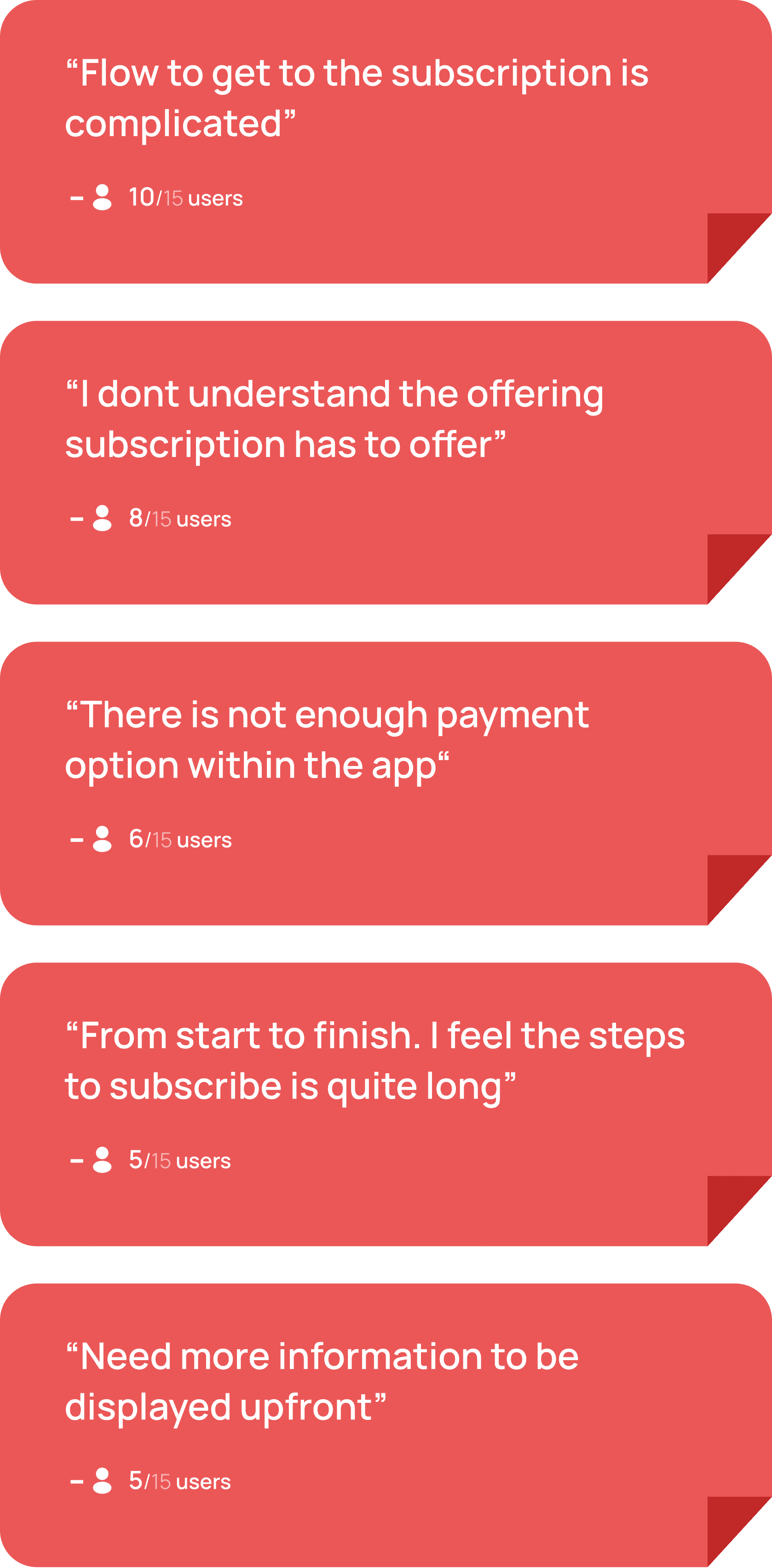
Based on the research and user interview, we have identified several pain points that we’ve grouped to some main categories.
1. Numerous amount of ineffective ….steps that user needs to follow
"Too many steps of purchasing a package, can some pages just merged in one page or a few pages can be removed?"
This issue may cause users to refrain from purchasing the premium package
Users often express frustration as they said :
2. User believes payment method can ….be removed, since it’s all integrated ….to Apple/Google Pay
It seems the user feels the “Payment Method” page isn’t needed, since Apple or Google Pay already handles transactions smoothly. User sees it as an extra step that could be skipped.
3. Discomfort viewing a package due ….to the small package cards
While on the “Subscription” page, users encounter discomfort from the small interface size and its scattered appearance, which makes it challenging to view each packages available in Vision+.
Defining The Problem (Research & Summary)
From In-Depth-Interview (IDI), we will understand what users likes and dislikes. We will also understand the purpose of subscribing the package. And the most important thing is we can get additional ideas from them to make purchasing subscribe package easier.
Here are some common insights we gathered from the feedback, along with how many users mentioned each one:
🗒️ Affinity Mapping
Here are some common insights we gathered from the feedback, along with how many users mentioned each one:
User Journey Mapping

Design Opportunity
❓ How Might We?
Make the flow journey is more simplified?
Make it easier and clearer for users purchasing premium package in Vision+?
Enhance the user interface for better accesibility?
Based on our research and data collection, we pinpoint opportunities for our design utilizing the How Might We framework.
User Flow

Major Design Iterations
1. Subscription Package
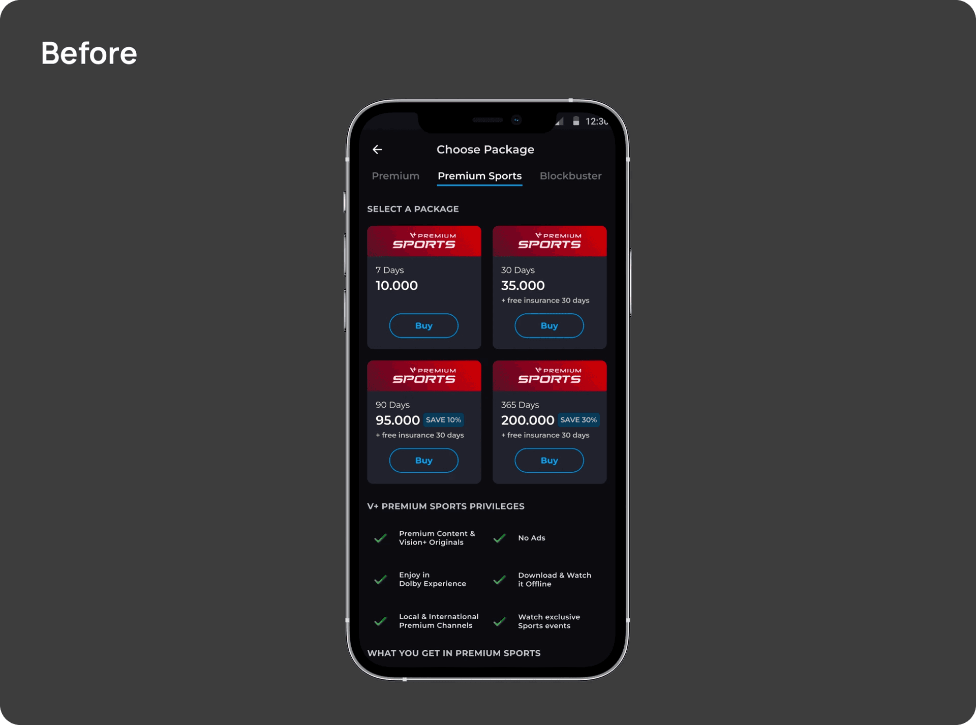
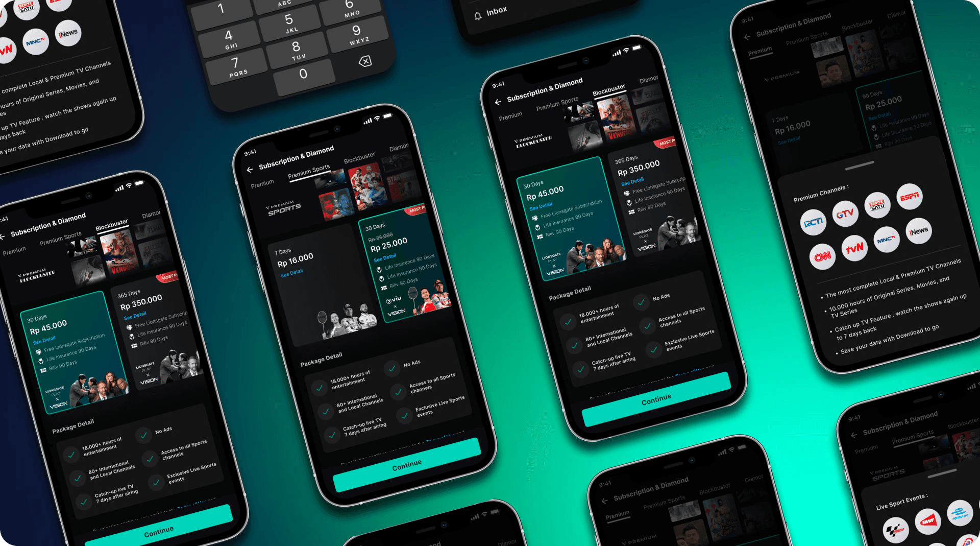
As users navigate the “subscription” page, they encounter discomfort due to small interface and its scattered layout. It's hard to tell one package from another on Vision+ because they all look too much alike.
2. Many extra features are scattered ….around with no clear place to find ….them
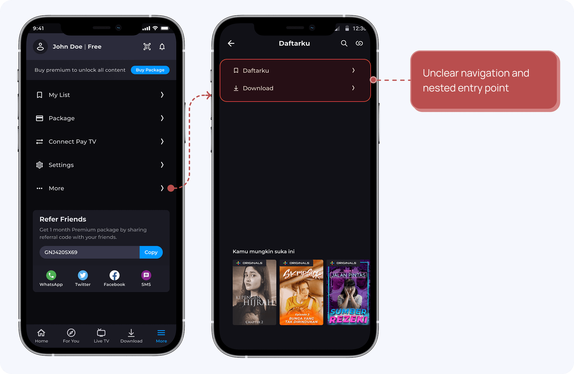
Users often search for secondary features such as "Daftarku" and "Download". However, they must navigate through multiple pages within the app to find these features due to the lack of centralized access points.
3. Users see Vision+ as less secure ….due to hidden security features
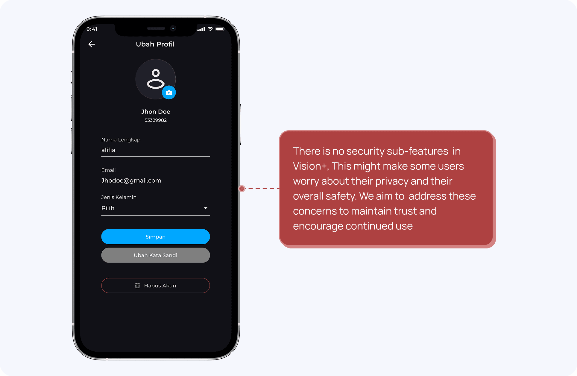
User generally does not notice the distinction of security features within the app, as password management and account recovery options does not have a strong visual cue. This lack of visibility further enforce the impression of the app as not secure across tech savvy users.
Major Design Iteration
1. Profile

The 2.0 rebranding of the profile page does not allow for sub/multi accounts and does not provide access to profile editing.
“Notification” on the top right can be distracting for users focused on configuring settings and exploring sub-features.
The current profile page has issues with feature placement, with some features being too general or incorrectly nested. Notably, "Transaction history" is hidden in the package section and the "Pay TV account" lacks detailed information.
Smoother, easier journey and interface to subscribe premium package
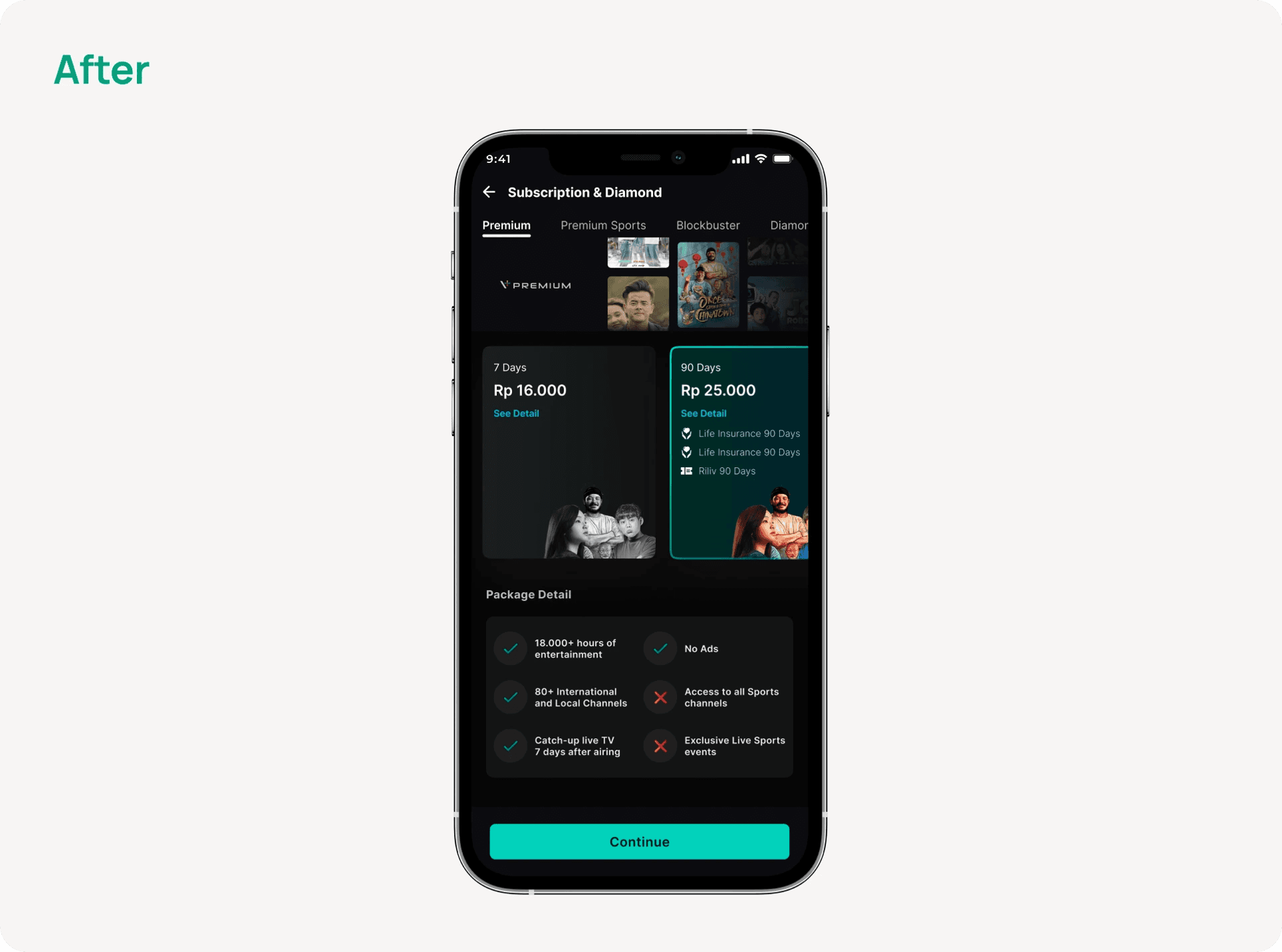
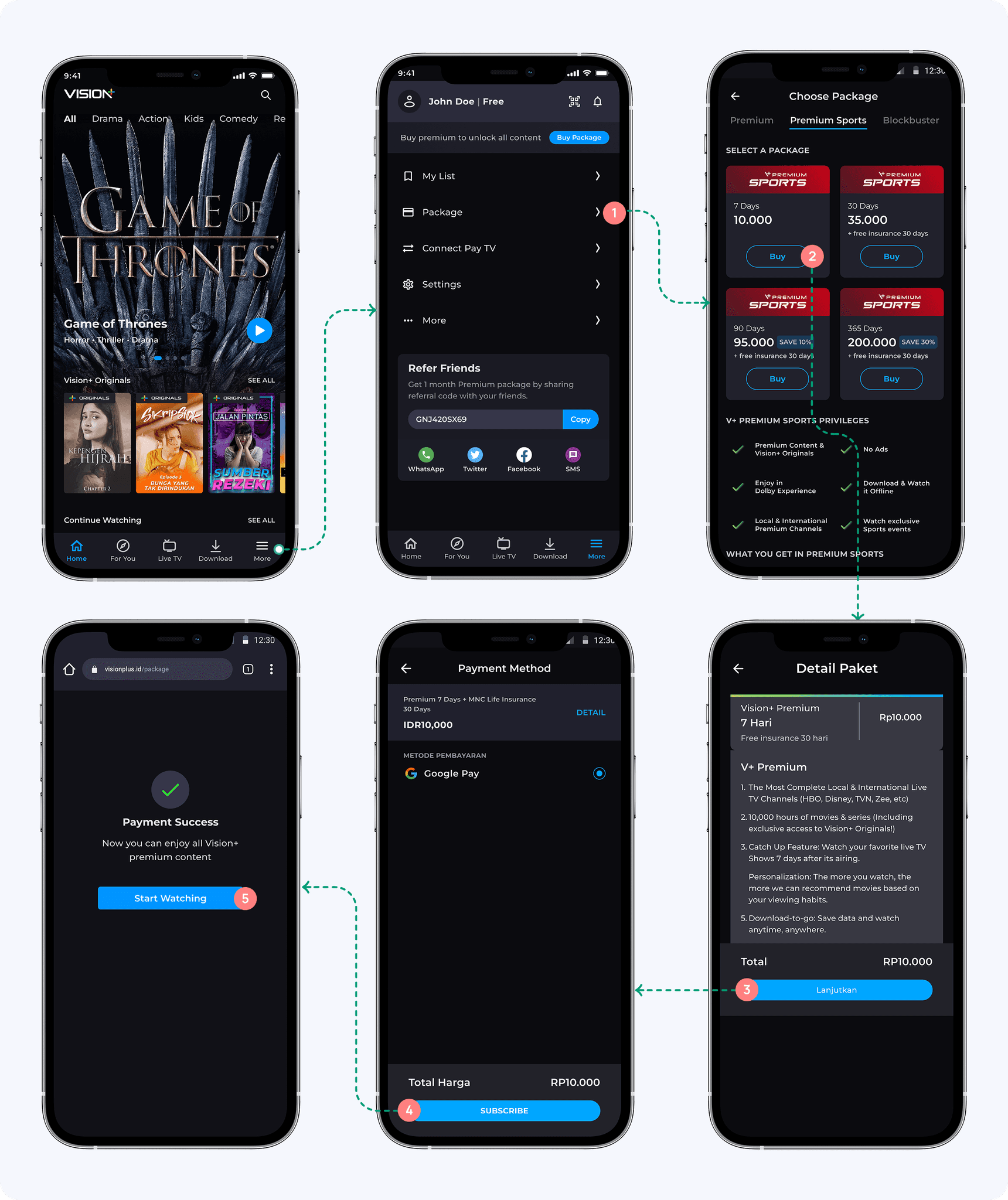
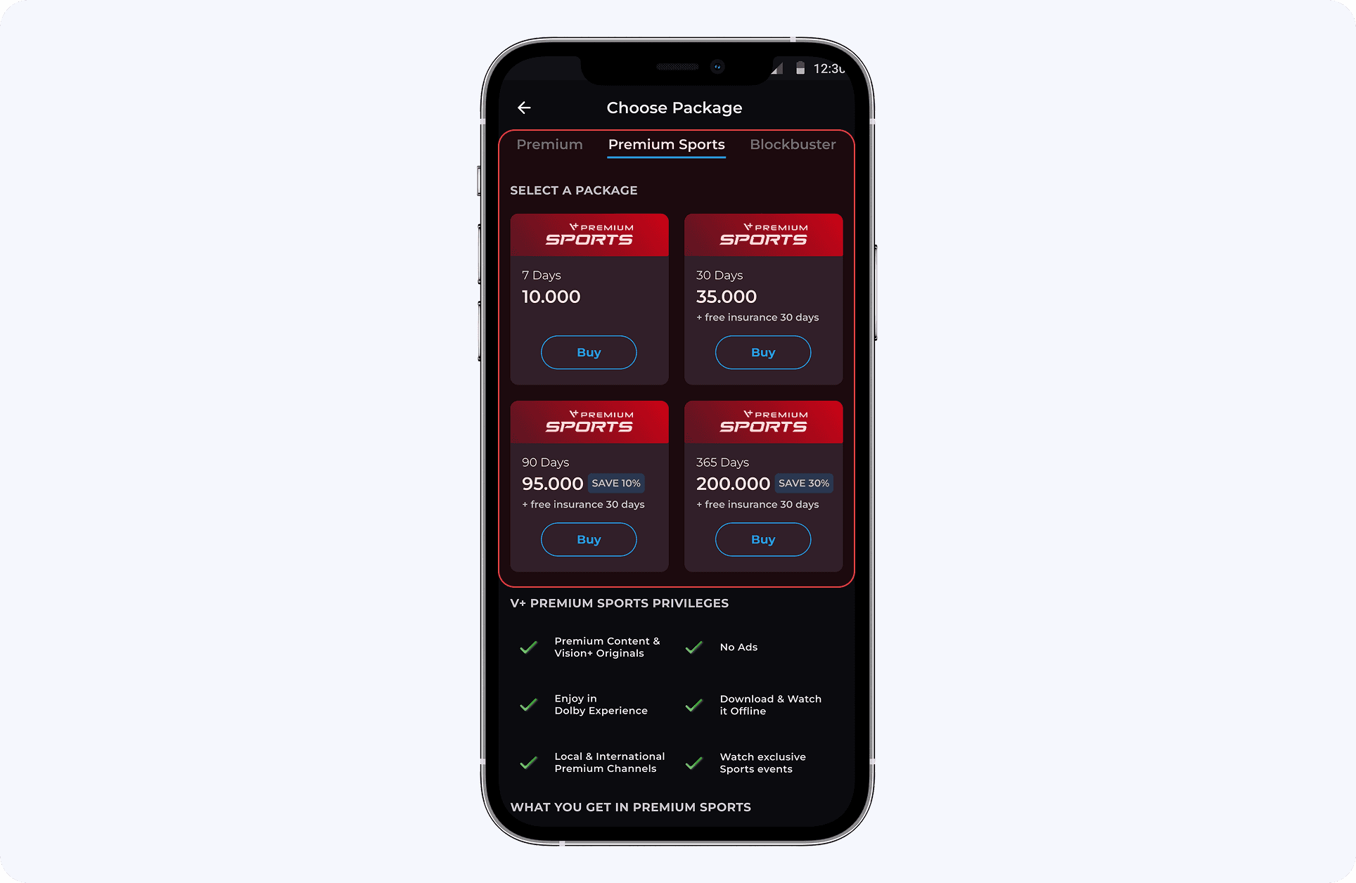
We updated the “subscription” page to make it simpler for users to see the premium package. The interface is now more informative and clearer. When users haven't tapped a package, it's in grayscale, but it switches to green when users tap on it.
2. See Package Detail
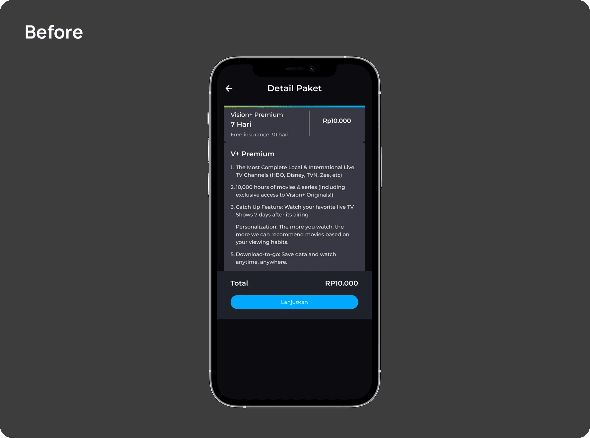
The "Package Detail" page feels a bit unnecessary and could be combined with the "Subscription" page. Since payments are already handled through Google or Apple Pay, keeping them separate just adds extra steps for users.
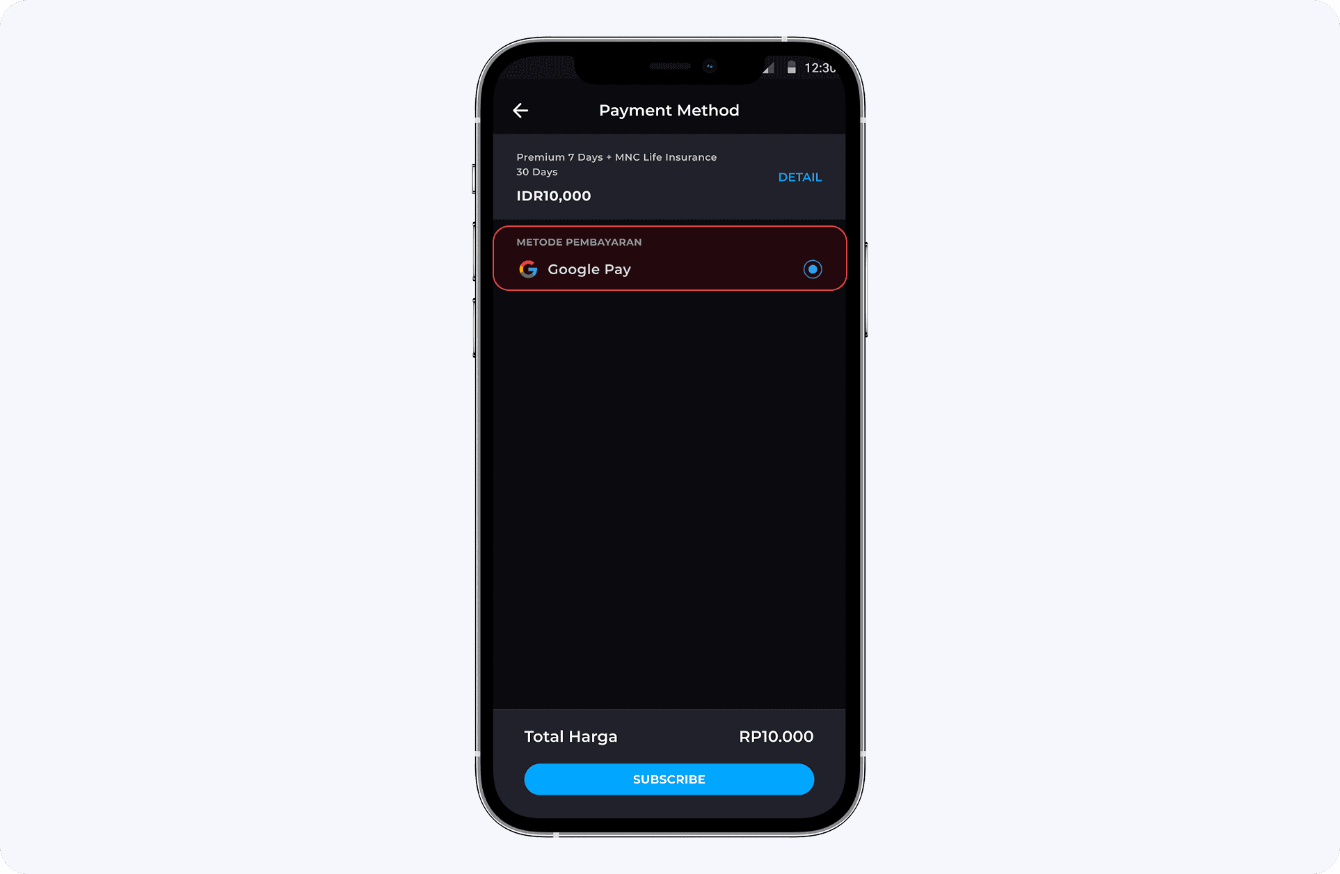
3. Payment Method
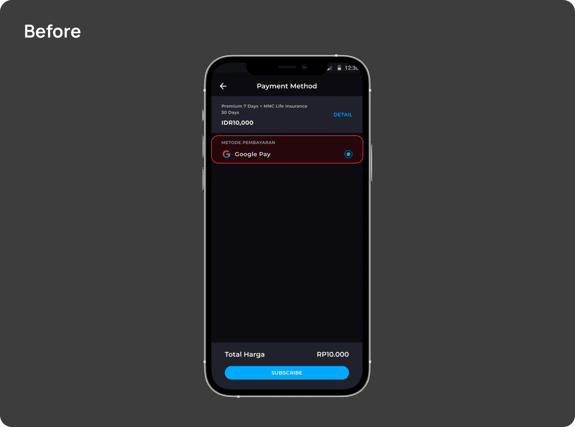
User requires to follow a cumbersome process to access “payment method” page
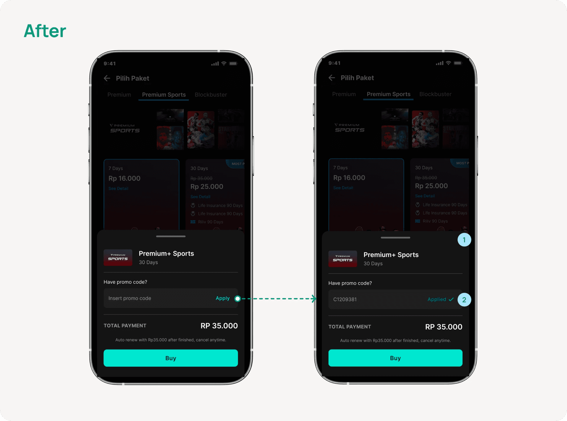
“Payment method” page lacks a field for applying promo
As there's only one payment method available, there's no need for a radio button selection
Streamlined the access of payment process
Clicking the "continue" button now reveals the payment method page as a drawer, reducing the length of the payment process, and eliminating the need for the payment method option as it's seamlessly integrated with Google/Apple Pay
The “promo field” has been integrated, enabling users to apply a promo or discount voucher
4. Transaction

On this page, the payment transaction details are not shown, and there's no option to redirect for checking payment status; instead, it prompts users with a "start watching" button.
Merged the payment transaction detail and status within the same page
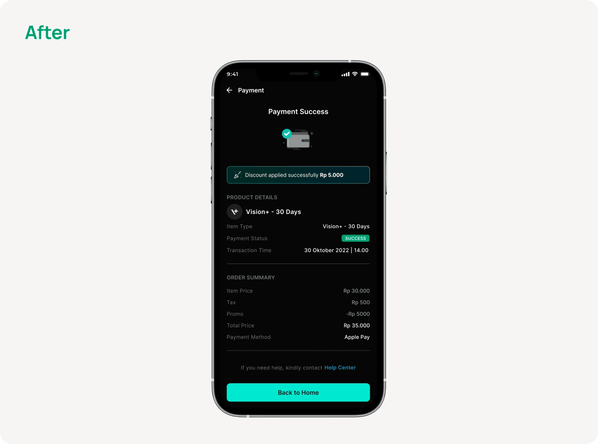
Incorporated a “payment status” and “transaction details” into a single page improves user accessibility and offers a more transparent method for users to review their transaction information.
▶️ The Prototype
Simplify the user flow within the same page
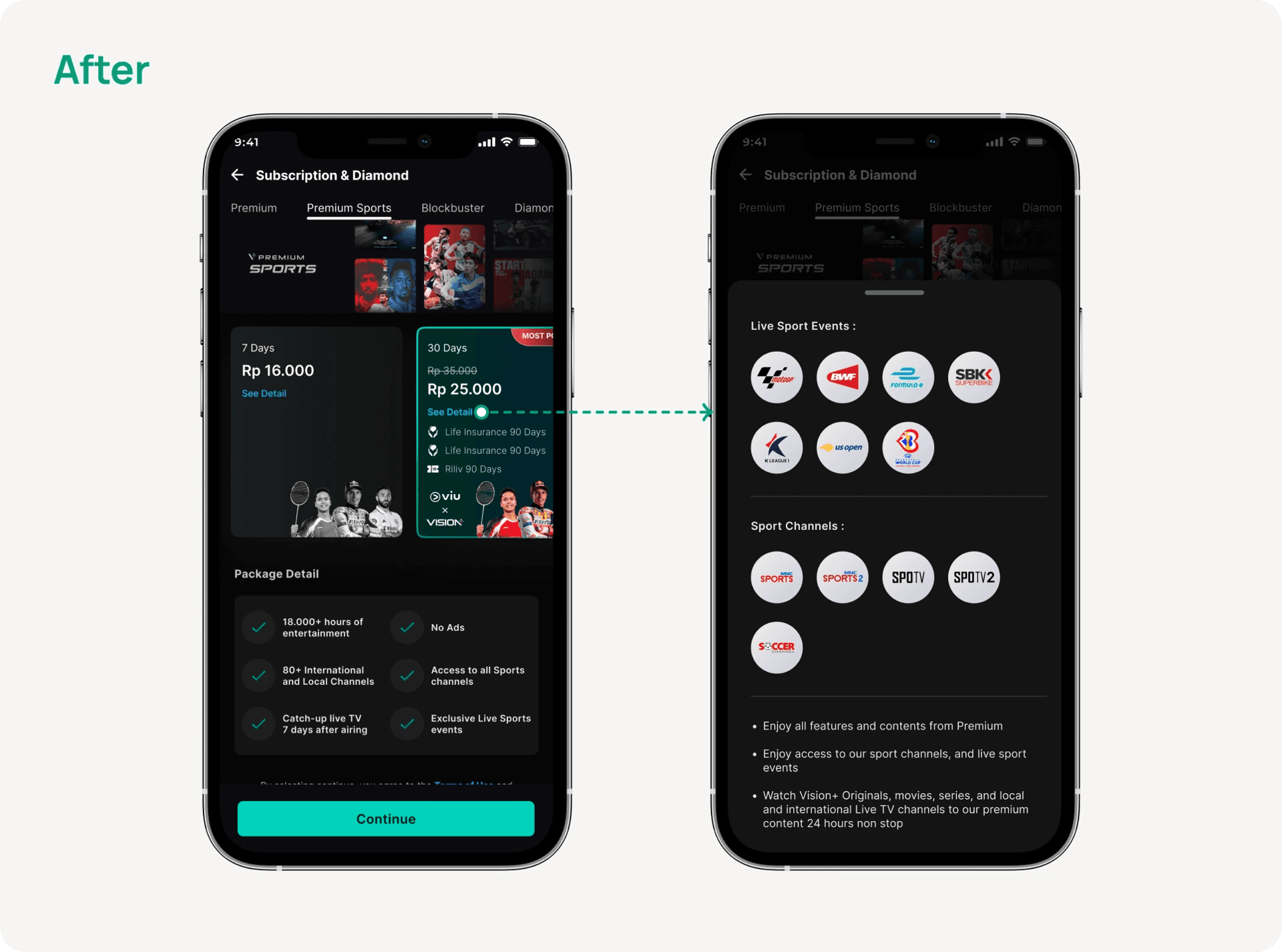
Users can now access package details with just one tap, without being redirected to another page. We've simplified the process by integrating the detailed information page as a drawer within the “subscription” page.
Desktop Iteration
▶️ The Prototype
Key Takeaway
Reworking the subscription feature came with its own set of challenges, but also some great takeaways. Here are a couple of key things my team and I learned along the way:
1. Tallk to Users
Talking to users gave us a clearer picture of what they actually needed. One big insight? People wanted more flexibility, like being able to choose between monthly or yearly plans. So, we added those options right away to better match their preferences.
These lessons helped us shape a more thoughtful and user friendly subscription experience. We’ll keep building on them as we continue to improve the app for everyone.
2. Balance is Key
It was important to strike a healthy balance between business goals and a smooth user experience. We kept our subscription plans simple and transparent, so users would feel confident signing up, without pressure. We also introduced a free trial to let them explore the service before making a commitment.
Next
Improving Profile Page: Navigation and Engagement

Planning The Research
💡 Defining The Objective Goals
Streamline the user flow touchpoint for simplicity
Integrate package details into a single page, such as the SKU denom page
Improve the accessibility of each page for easier navigation
✍️ Scoping
Defining Research Questions
There are several key areas we wanted to focus on in regards to the subscription flow. Users were interviewed based on three distinct themes, which are:
1. Ease of Access
Can users access the subscription fairly easily? Will there be any steps they perceive as redundant or confusing?
2. Information Display
Does users have enough information to be convinced to subscribe? Is there any information that is being displayed prominently enough?
3. Payment
Can users easily completes their subscription flow?
Conducting The Research
From In-Depth-Interview (IDI), we will understand what users likes and dislikes. We will also understand the purpose of subscribing the package. And the most important thing is we can get additional ideas from them to make purchasing subscribe package easier.
Key Findings From Research
Based on the research and user interview, we have identified several pain points that we’ve grouped to some main categories.
1. Numerous amount of ineffective steps that user needs to follow
Users often express frustration as they said :
"Too many steps of purchasing a package, can some pages just merged in one page or a few pages can be removed?"
This issue may cause users to refrain from purchasing the premium package.
2. User believes payment method can be removed, since it’s all integrated to Apple/Google Pay
2. User believes payment method can be removed, since it’s all …..integrated to Apple/Google Pay
It seems the user feels the “Payment Method” page isn’t needed, since Apple or Google Pay already handles transactions smoothly. User sees it as an extra step that could be skipped.
3. Discomfort viewing a package due to the small package cards
While on the “Subscription” page, users encounter discomfort from the small interface size and its scattered appearance, which makes it challenging to view each packages available in Vision+.
Defining The Problem (Research Summary)
🗒️ Affinity Mapping
Here are some common insights we gathered from the feedback, along with how many users mentioned each one:

User Journey Mapping
Design Opportunity
Based on our research and data collection, we pinpoint opportunities for our design utilizing the How Might We framework.
❓ How Might We?
Make the flow journey is more simplified?
Make it easier and clearer for users purchasing premium package in Vision+?
Enhance the user interface for better accesibility?
User Flow
User Flow

Major Design Iterations
1. Subscription Package
As users navigate the “subscription” page, they encounter discomfort due to small interface and its scattered layout. It's hard to tell one package from another on Vision+ because they all look too much alike.
Smoother, easier journey and interface to subscribe premium package
We updated the “subscription” page to make it simpler for users to see the premium package. The interface is now more informative and clearer. When users haven't tapped a package, it's in grayscale, but it switches to green when users tap on it.
2. See Package Detail
The "Package Detail" page feels a bit unnecessary and could be combined with the "Subscription" page. Since payments are already handled through Google or Apple Pay, keeping them separate just adds extra steps for users.
Simplify the user flow within the same page
Users can now access package details with just one tap, without being redirected to another page. We've simplified the process by integrating the detailed information page as a drawer within the “subscription” page.
3. Payment Method
User requires to follow a cumbersome process to access “payment method” page
“Payment method” page lacks a field for applying promo
As there's only one payment method available, there's no need for a radio button selection
Streamlined the access of payment process
Clicking the "continue" button now reveals the payment method page as a drawer, reducing the length of the payment process, and eliminating the need for the payment method option as it's seamlessly integrated with Google/Apple Pay
The “promo field” has been integrated, enabling users to apply a promo or discount voucher
4. Transaction
On this page, the payment transaction details are not shown, and there's no option to redirect for checking payment status; instead, it prompts users with a "start watching" button.
Merged the payment transaction detail and status within the same page
Incorporated a “payment status” and “transaction details” into a single page improves user accessibility and offers a more transparent method for users to review their transaction information.
▶️ Play The Prototype
Desktop Iterations
▶️ The Prototype
Key Takeaway
Reworking the subscription feature came with its own set of challenges, but also some great takeaways. Here are a couple of key things my team and I learned along the way:
1. Talk to Users
Talking to users gave us a clearer picture of what they actually needed. One big insight? People wanted more flexibility, like being able to choose between monthly or yearly plans. So, we added those options right away to better match their preferences.
2. Balance is Key
It was important to strike a healthy balance between business goals and a smooth user experience. We kept our subscription plans simple and transparent, so users would feel confident signing up, without pressure. We also introduced a free trial to let them explore the service before making a commitment.
These lessons helped us shape a more thoughtful and user friendly subscription experience. We’ll keep building on them as we continue to improve the app for everyone.
Next
Improving Profile Page: Navigation and Engagement
Enabling online purchases with BSI VISA debit cards and simplifying e-commerce activation to overcome previous challenges and support growth.
Next
Improving Profile Page: Navigation and Engagement
Enabling online purchases with BSI VISA debit cards and simplifying e-commerce activation to overcome previous challenges and support growth.