Improving Profile Page: Navigation and Engagement
Role
Product Designer, UI/UX Consultant
Role
Product Designer, UI/UX Consultant
Teams
UX Writer, UX Researcher, Business Analyst, Product Owner
Teams
UX Writer, UX Researcher, Business Analyst, Product Owner
Platform
Mobile App
Platform
Mobile App
Timeframe
2022
Timeframe
2022
Category
FinTech, Mobile Banking
Category
FinTech, Mobile Banking
Role
Product Designer, UI/UX Consultant
Teams
UX Writer, UX Researcher, Business Analyst, Product Owner
Platform
Mobile App
Timeframe
2022
Category
FinTech, Mobile Banking
Role
Product Designer
Teams
UX Writer, UI Illustrator, UX Researcher
Platform
Mobile App, Desktop
Timeframe
2022
Category
Video Streaming Service

Improving Profile Page: Navigation and Engagement
Role
Product Designer, UI/UX Consultant
Teams
UX Writer, UX Researcher, Business Analyst, Product Owner
Platform
Mobile App
Timeframe
2022
Category
FinTech, Mobile Banking
Role
Product Designer, UI/UX Consultant
Teams
UX Writer, UX Researcher, Business Analyst, Product Owner
Platform
Mobile App
Timeframe
2022
Category
FinTech, Mobile Banking
Role
Product Designer
Teams
UX Writer, UI Illustrator, UX Researcher
Platform
Mobile App, Desktop
Timeframe
2022
Category
Video Streaming Service
Project Summary
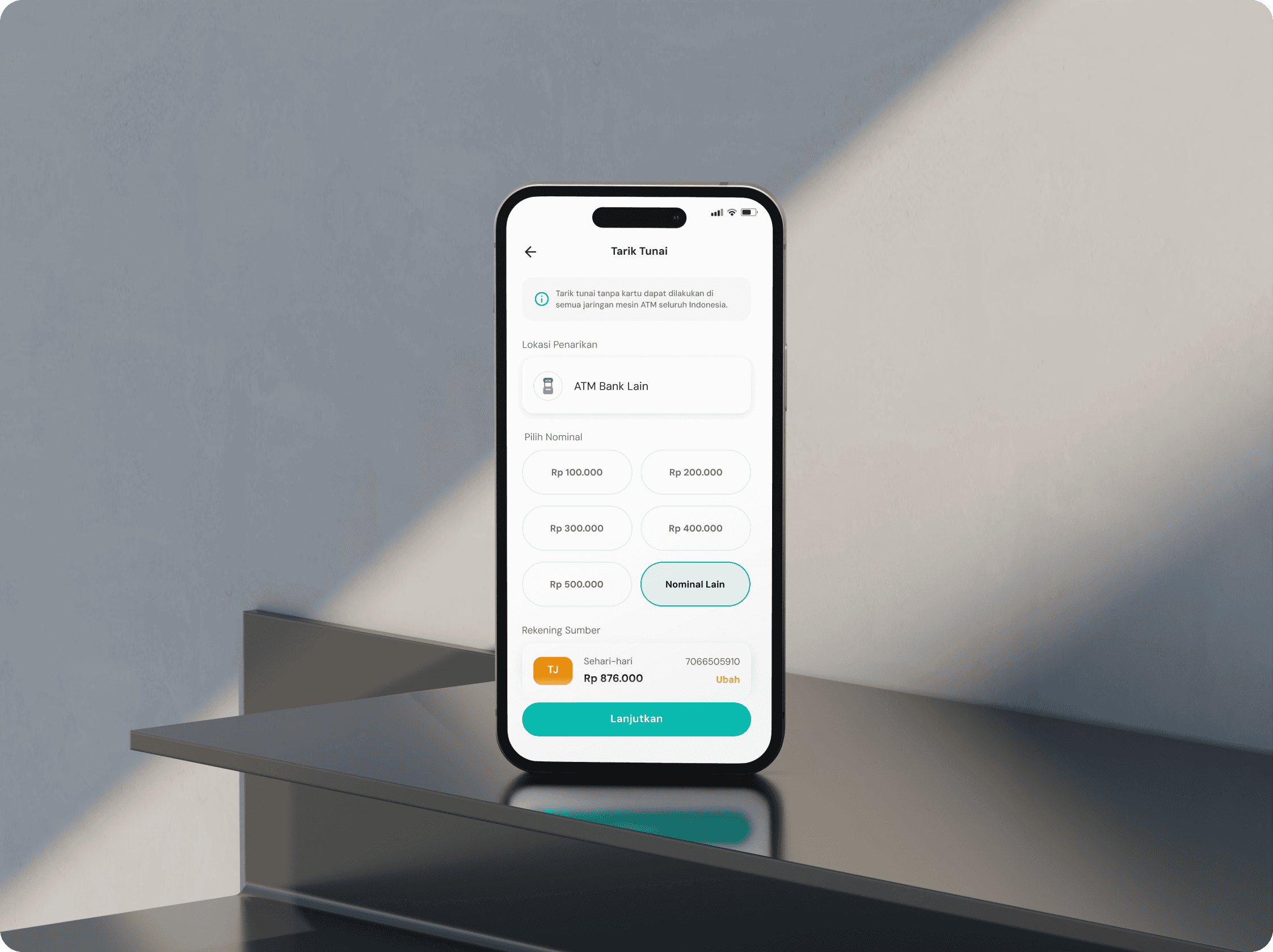
Bank Syariah Indonesia (BSI) wanted to make it easier for users, especially those in rural areas to access their cash without relying on a physical debit card. Many of these users didn’t live near a BSI ATM, which meant they had to travel further or pay extra fees to use third-party machines.
The idea was to create a cardless withdrawal feature that was simple, secure, and easy to find in the app. By allowing users to withdraw money from a wider network of ATMs without a card, we aimed to remove common pain points and make the experience much more convenient for BSI customers.
Background
Our researcher conducted user interviews and found that the current account page is difficult to navigate due to lack of context for the features. The page lacks sufficient proximity, contrast, and personalization. Moreover, despite concerns about account security, most users do not use our available security features.
The purpose of this redesign is to improve ease of access and navigation through existing features, encourage users to enhance their account security, raise awareness of our loyalty program, and increase user engagement with our app.
Design Framework
Design Framework
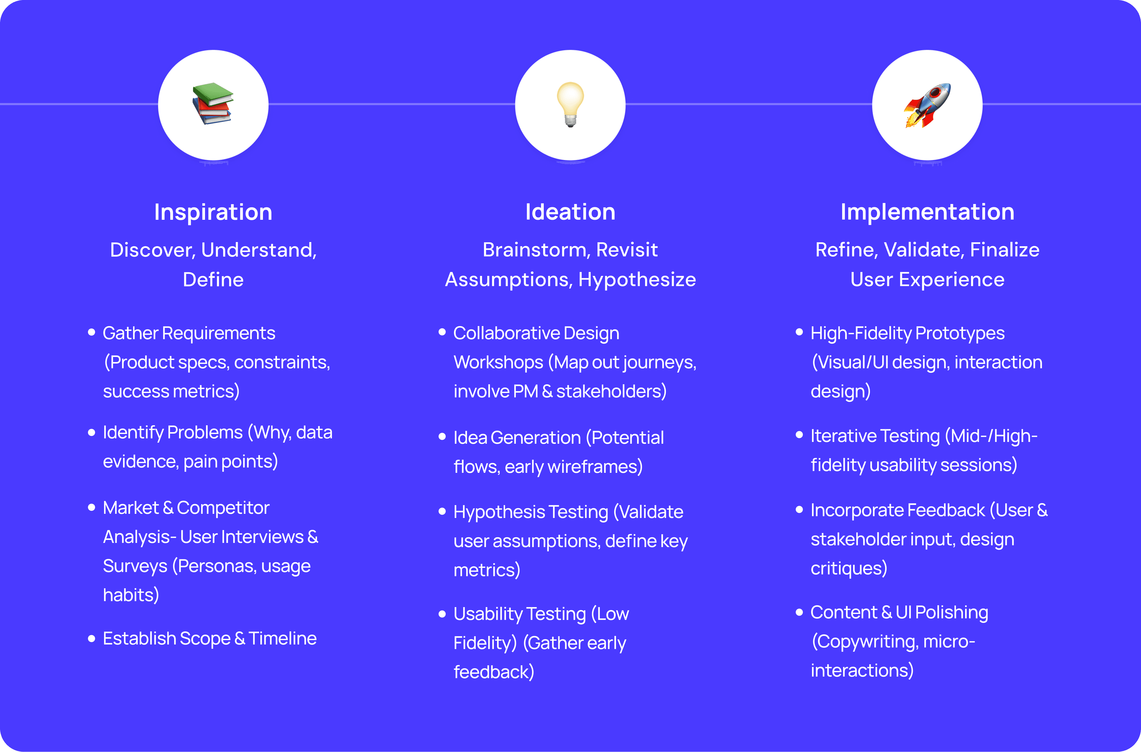
Design Framework
Design Framework
Planning The Research
💡 Defining The Objective
The objective here is to explore motivations and identify pain points or barriers. I aim to delve deeply into a specific issue to uncover the root cause. This is my research objective:
"Enhance the user experience on the app's account page?"
✍️ Scoping
Who/What : Users (across 10 users, aged between 18-25 y.o)
Where : Jakarta
Design Framework
Existing Design

Defining Research Questions
💬 Our Approach
1. Personalization
Has the app done enough to tailor users experience based on their unique preferences and behavior?
2. Sub-Features Visibility
Can users easily navigate through all of the features within the app, including secondary and tertiary features?
3. Security
Has the app done enough to manage the security of user’s account?
The research questions are the primary inquiries that need to be addressed by the conclusion of the study. Users were interviewed based on three distinct themes, which are:
Listing The Hypothesis
Users lack motivation to spend more time to explore the profile features.
Users find it challenging to understand the flow of the profile page, and this doesn't motivate them to explore its features.
Users feel disconnected from their accounts and find it challenging to explore profile page features.
Conducting The Research
We use an In-Depth-Interview (IDI) as a research method to understand the user likes and dislikes. The crucial aspect is gaining additional insights from users to enhance profile features.
Defining The Problem (Research Summary)
🗒️ Affinity Mapping
3. Security
1. Personalization
2. Sub-Features Visibility
Based on the users interview we conducted, we've identified several user challenges. These issues fall into three main categories:
Design Opportunity
From the research and data collection carried out, we identify opportunities that can be done in our design using the HMW framework:
❓ How Might We?
Make the navigation clearer?
Make it more personalized, welcoming, and rewarding for users?
Make user feel more secure?
User Flow

Key Design Research
Based on the interviewed users feedback, the key problems that issue normally faced can be summarized as such:
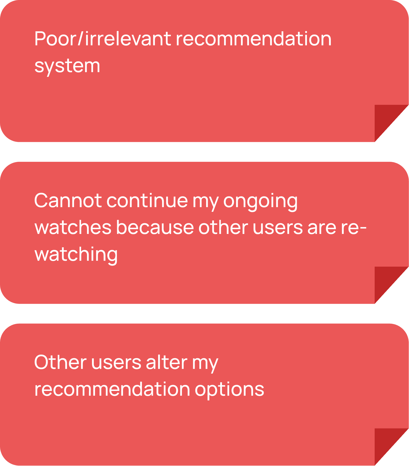
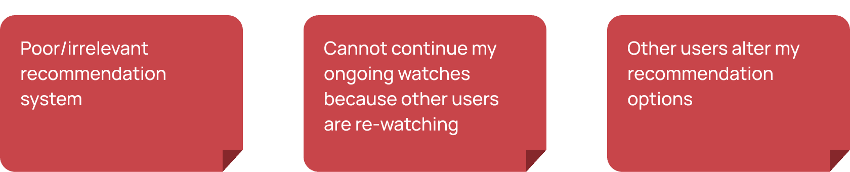
1. Users who share their accounts ….prefer to keep their watch history ….and recommendations intact
One of the main issues users have raised about account sharing is the lack of personalization within the accounts.
As more people use the same account, users may find it challenging to track their last watched episodes and receive relevant recommendations. This is because:
Rewatched previously watched episodes by other users
Adversely influence recommendation algorithm for other user
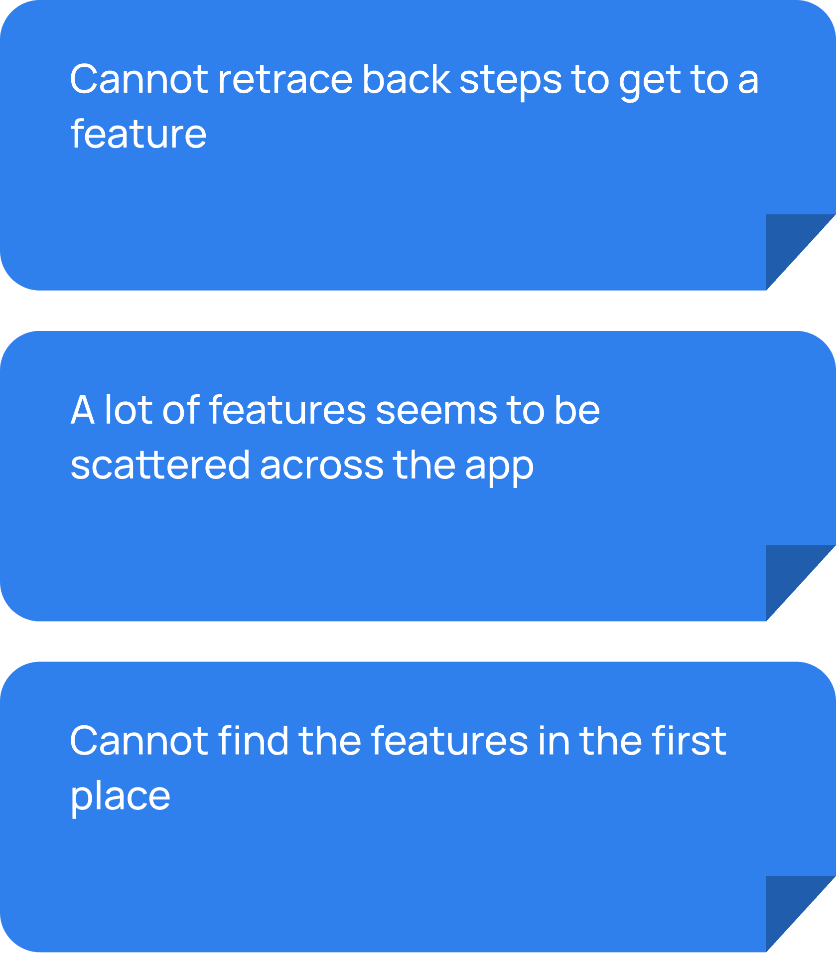
2. Many extra features are scattered ….around with no clear place to find ….them
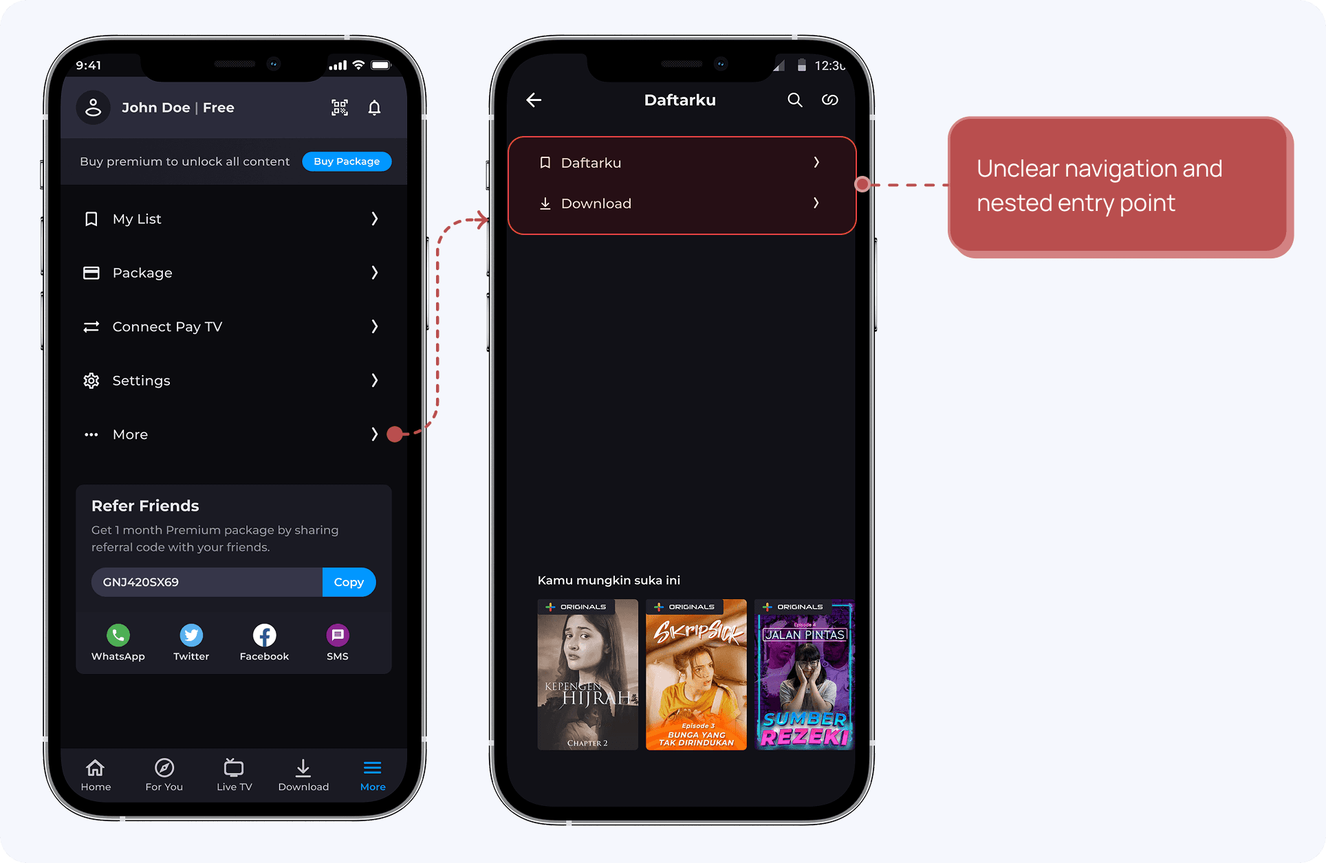
Users often search for secondary features such as "Daftarku" and "Download". However, they must navigate through multiple pages within the app to find these features due to the lack of centralized access points.
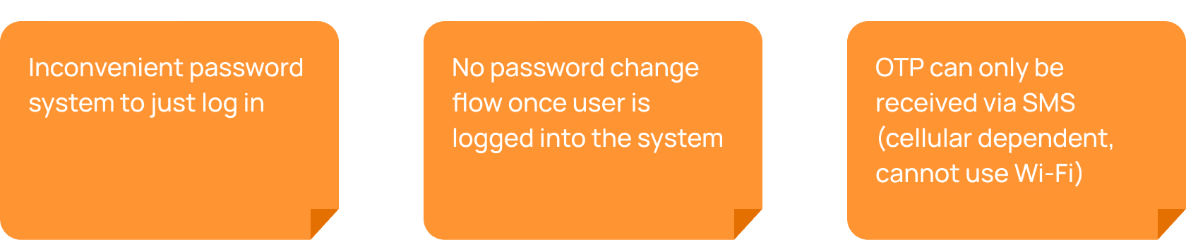
3. Users see Vision+ as less secure ….due to hidden security features
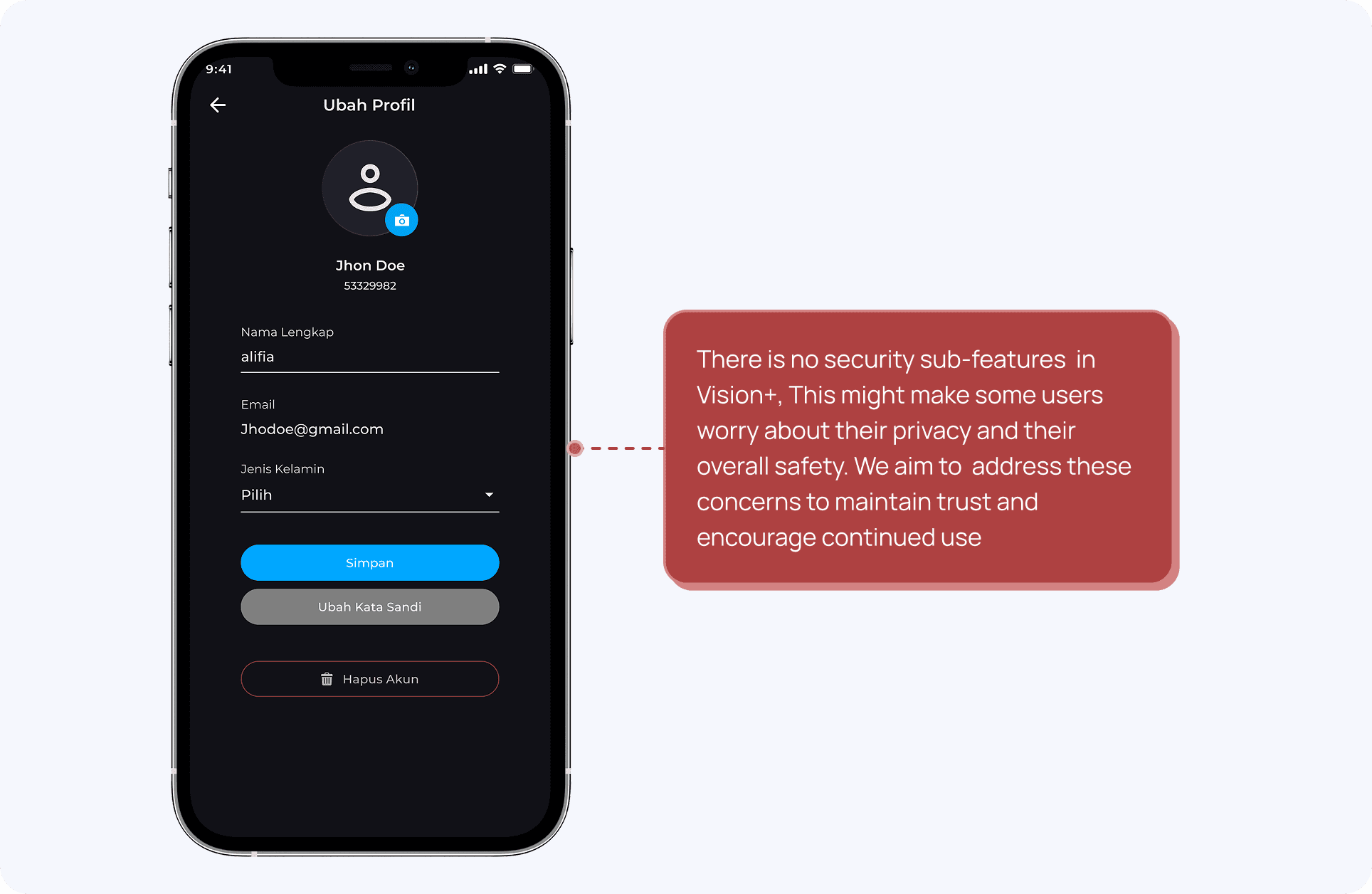
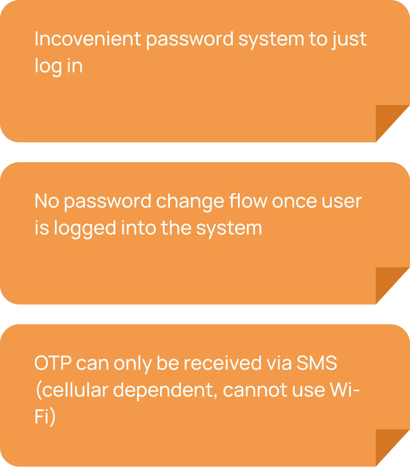
User generally does not notice the distinction of security features within the app, as password management and account recovery options does not have a strong visual cue. This lack of visibility further enforce the impression of the app as not secure across tech savvy users.
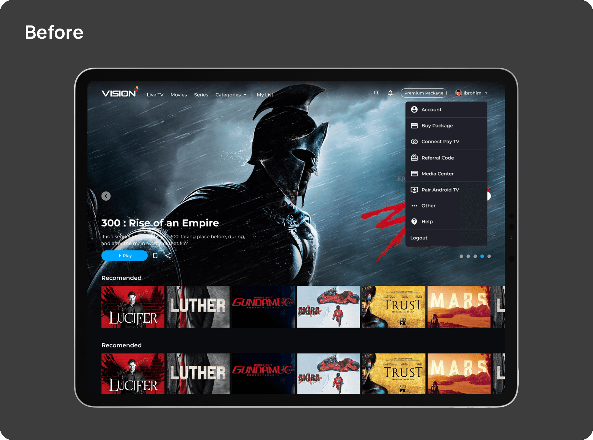
Major Design Iteration
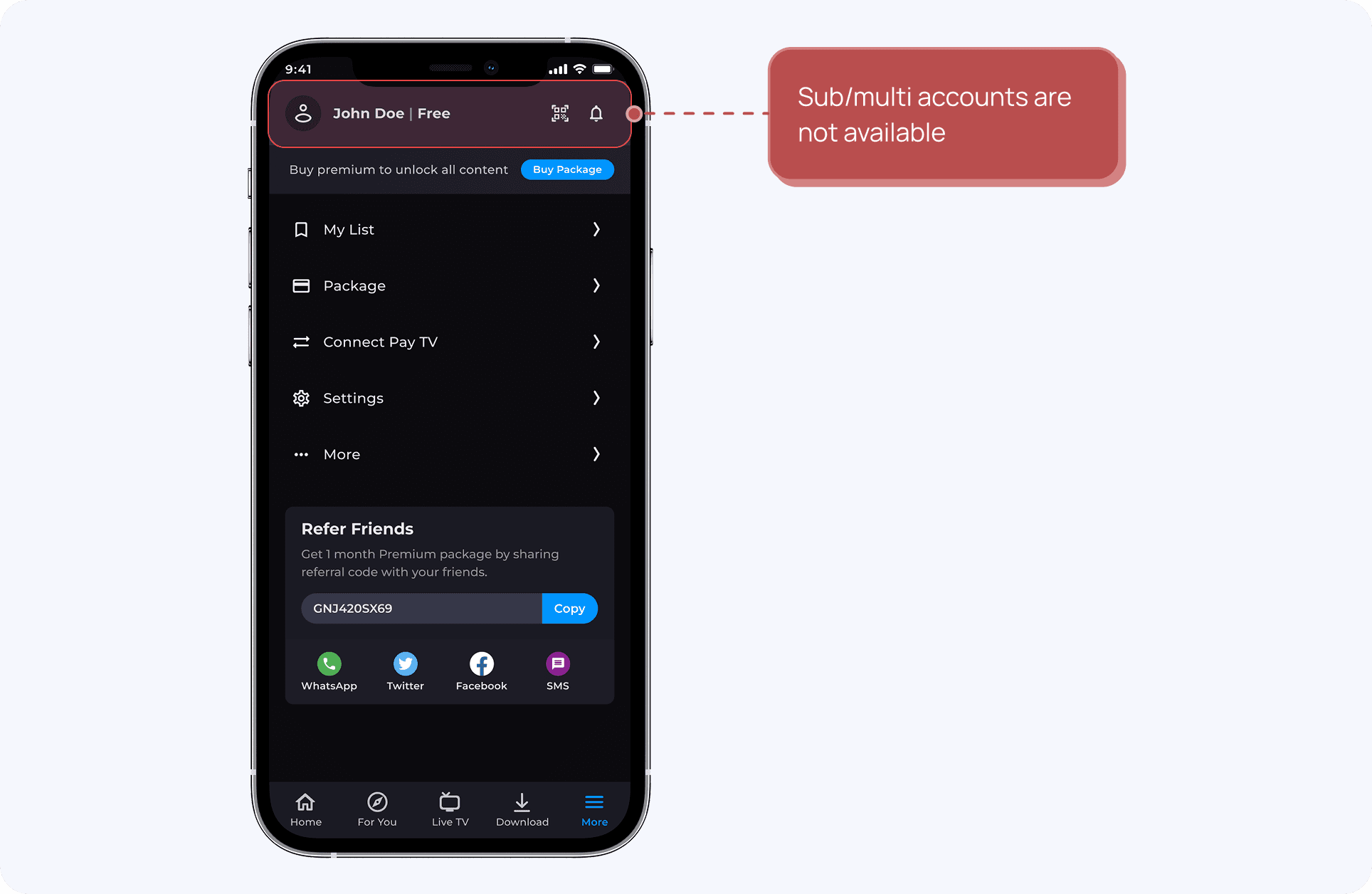
1. Profile

The 2.0 rebranding of the profile page does not allow for sub/multi accounts and does not provide access to profile editing.
“Notification” on the top right can be distracting for users focused on configuring settings and exploring sub-features.
The current profile page has issues with feature placement, with some features being too general or incorrectly nested. Notably, "Transaction history" is hidden in the package section and the "Pay TV account" lacks detailed information.
Clearer grouping and closer placement of features on the Profile Page
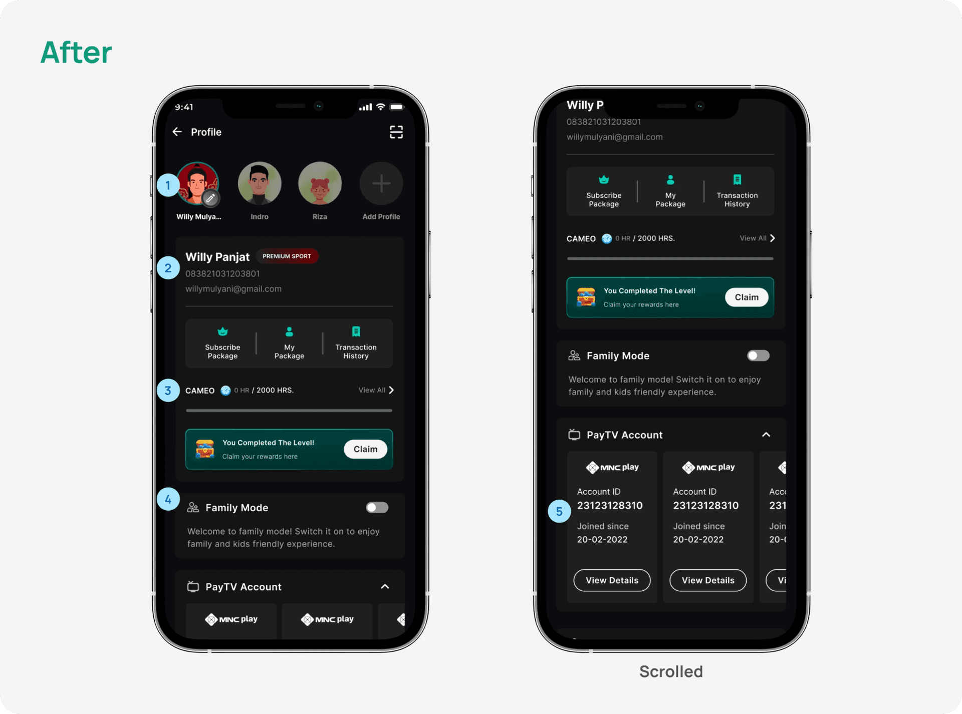
Multi/Sub Accounts are now grouped under the main profile section, with a handy pencil icon for quick access to edit profiles.
The Profile Page has been refreshed to highlight key info and now includes Package Details and Transaction History for easier subscription management.
A new Loyalty Program section has been added to encourage users to enjoy more content.
Introducing Family Mode—a simple way to filter VOD content for family-friendly or kids-only viewing.
The Pay TV Account section now features an expanded card layout, making it easier to view and link your Pay TV info.
2. Edit Profile
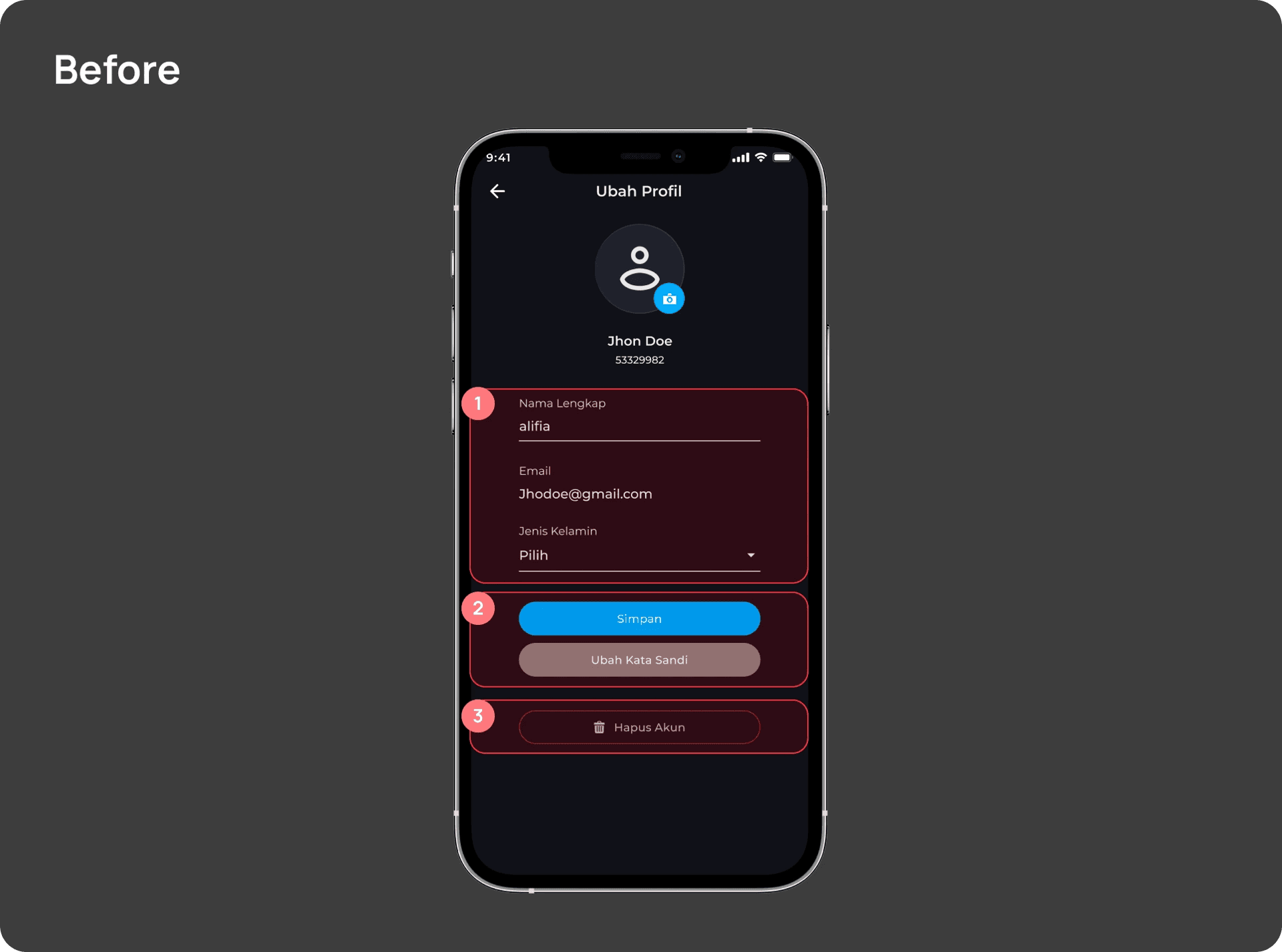
The old design feels too formal and lacks visual appeal.
CTA buttons are hard to distinguish, relying only on color, which can lead to confusion or misuse.
“Delete account” might be more effective to relocate, as the current placement doesn’t emphasize its urgency.
▶️ The Prototype
A one-tap feature to check account security and get quick tips to improve it
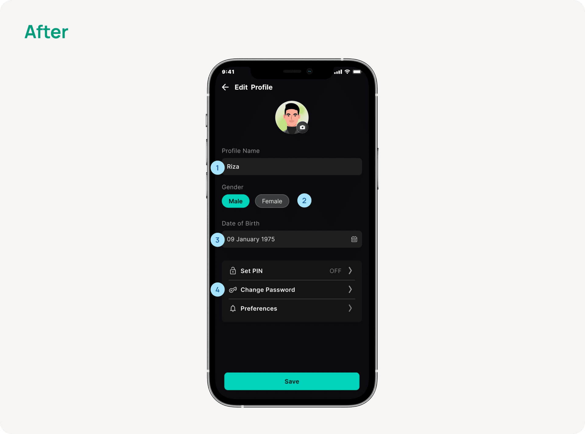
Redesigned with a cleaner layout and filled fields to make text easier to read.
Updated the “gender section” by simplifying the interaction using pill buttons while maintaining the functionality
Incorporated a “date of birth” as a new section to help personalize the experience with basic user info.
“Set PIN” and “change password” feature, so users can set a PIN and change your password directly from profile.
The "Set Preferences" feature allows users to expand their content categories. This way, users can enjoy the content categories of their choice
Desktop Iteration
1. Profile Section
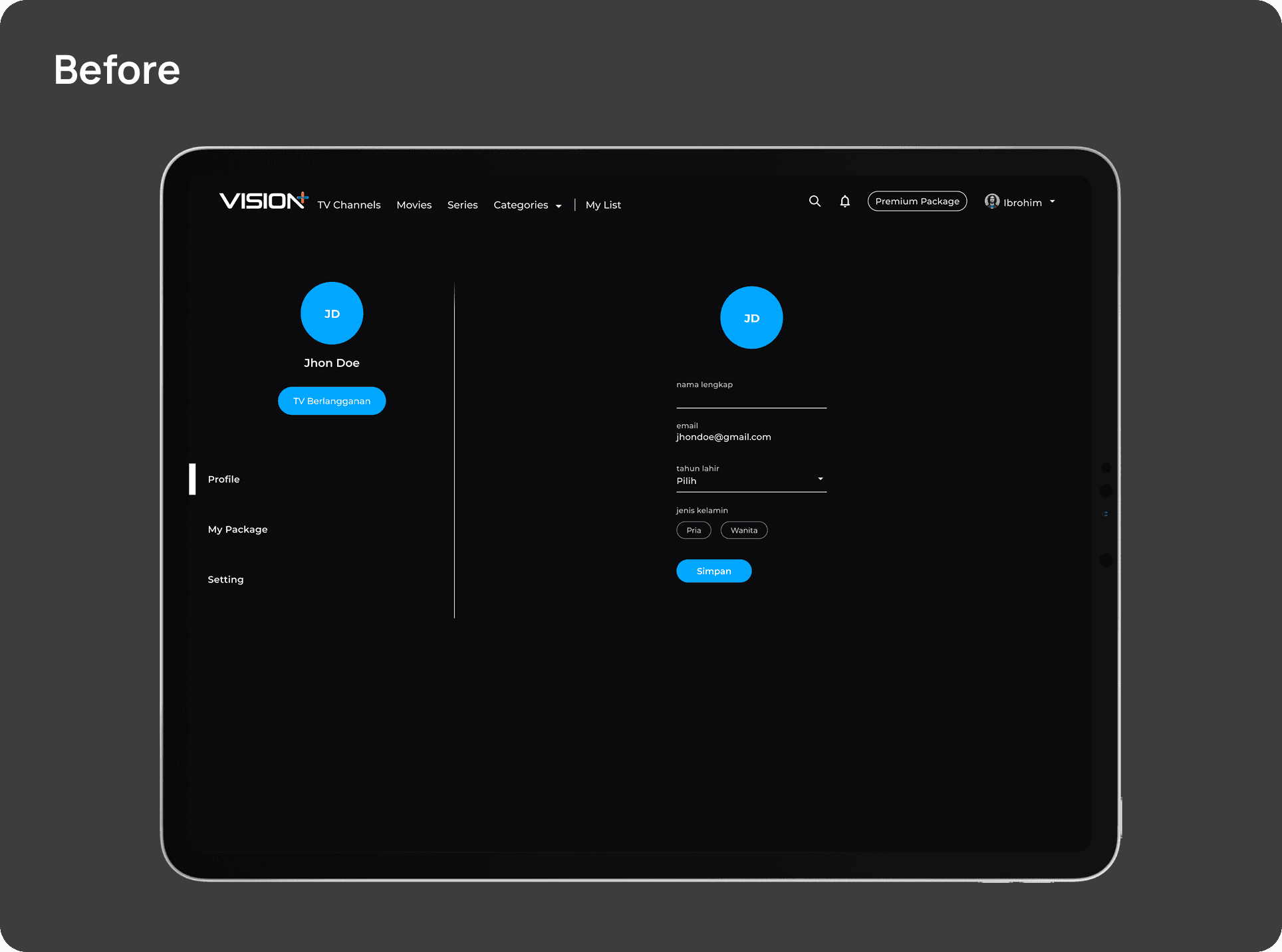
The current Profile Page feels outdated, with rigid text fields and scattered features. Important options typically found in a profile section, like multi/sub-account access are either missing or placed elsewhere in the app.
2. Home Section

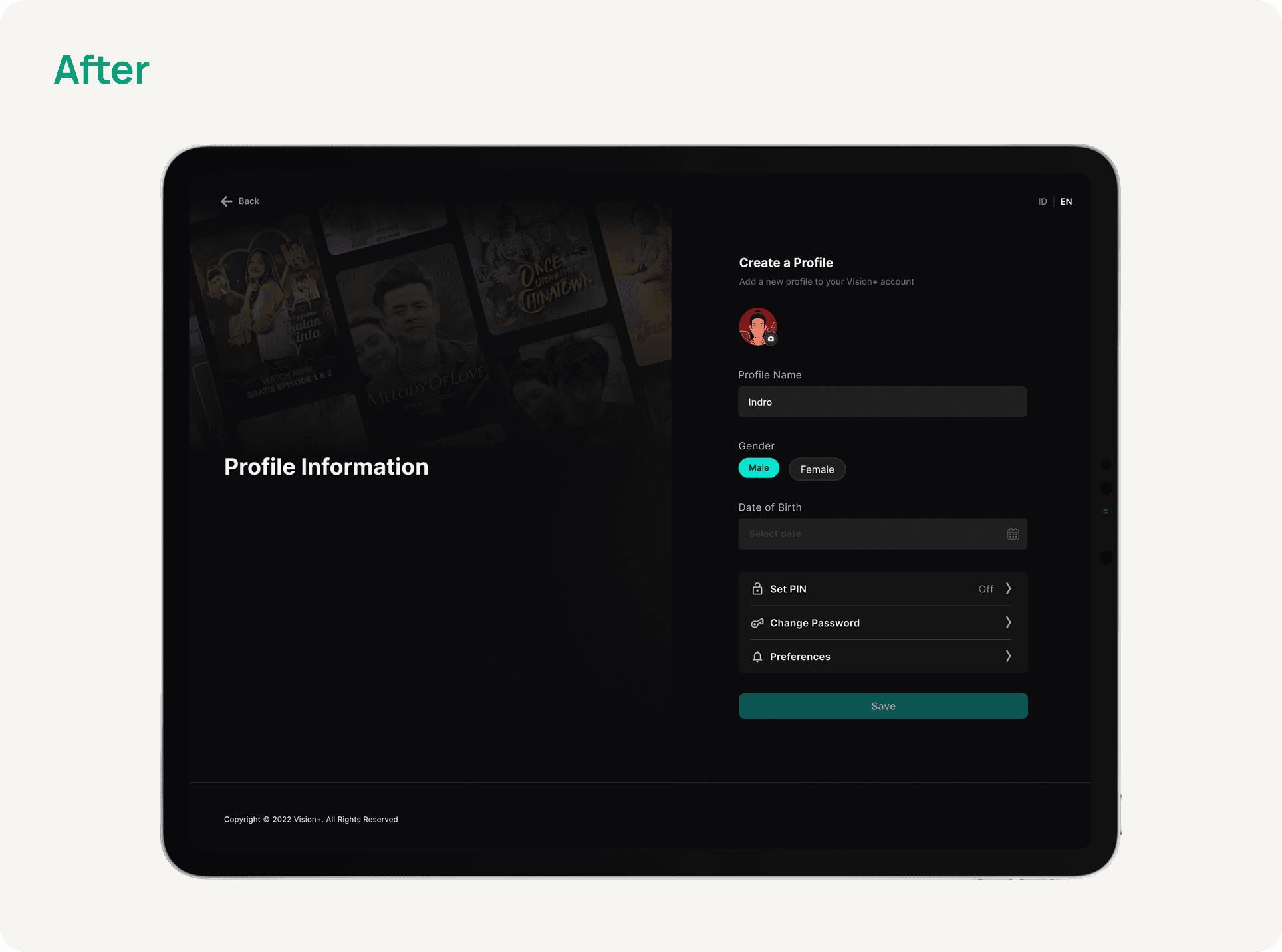
The new designs are more organized, featuring multi/sub-account support, improved security options like PIN setup and password changes, and a cleaner, more modern interface.
▶️ The Prototype
What I Learned
During my time at Vision+, I learned how valuable early user feedback is in shaping a project. For this one, we started gathering feedback a few weeks in, and it gave us solid insights that really helped guide our design decisions.
Next
Cardless Withdrawal for Bank Syariah Indonesia
Planning The Research
💡 Defining The Objective
The objective here is to explore motivations and identify pain points or barriers. I aim to delve deeply into a specific issue to uncover the root cause. This is my research objective:
"Enhance the user experience on the app's account page?"
✍️ Scoping
Who/What : Users (across 10 users, aged between 18-25 y.o)
Where : Jakarta
Defining Research Questions
💬 Our Approach
The research questions are the primary inquiries that need to be addressed by the conclusion of the study. Users were interviewed based on three distinct themes, which are:
1. Personalization
Has the app done enough to tailor users experience based on their unique preferences and behavior?
2. Sub-Features Visibility
Can users easily navigate through all of the features within the app, including secondary and tertiary features?
3. Security
Has the app done enough to manage the security of user’s account?
Listing The Hypothesis
Users lack motivation to spend more time to explore the profile features.
Users find it challenging to understand the flow of the profile page, and this doesn't motivate them to explore its features.
Users feel disconnected from their accounts and find it challenging to explore profile page features.
Conducting The Research
We use an In-Depth-Interview (IDI) as a research method to understand the user likes and dislikes. The crucial aspect is gaining additional insights from users to enhance profile features.
Key Design From Research
Based on the interviewed users feedback, the key problems that issue normally faced can be summarized as such:
1. Users who share their accounts prefer to keep their watch history and recommendations intact
One of the main issues users have raised about account sharing is the lack of personalization within the accounts.
As more people use the same account, users may find it challenging to track their last watched episodes and receive relevant recommendations. This is because:
Rewatched previously watched episodes by other users
Adversely influence recommendation algorithm for other user
2. Many extra features are scattered around with no clear place to find them
Users often search for secondary features such as "Daftarku" and "Download". However, they must navigate through multiple pages within the app to find these features due to the lack of centralized access points.
3. Users see Vision+ as less secure due to hidden security features
User generally does not notice the distinction of security features within the app, as password management and account recovery options does not have a strong visual cue. This lack of visibility further enforce the impression of the app as not secure across tech savvy users.
Defining The Problem (Research Summary)
🗒️ Affinity Mapping
Based on the users interview we conducted, we've identified several user challenges. These issues fall into three main categories:
1. Personalization
2. Sub-Features Visibility

3. Security
Additionally from business perspective, there are opportunities for better monetization and increasing average user screen time with the app:
Lack of motivations for users to spend more time watching content within the app
Gamification feature are not displayed prominently enough to encourage user to participate in in-game transactions
Design Opportunity
From the research and data collection carried out, we identify opportunities that can be done in our design using the HMW framework:
❓ How Might We?
Make the navigation clearer?
Make it more personalized, welcoming, and rewarding for users?
Make user feel more secure?
User Flow
User Flow
Major Design Iterations
1. Profile
The 2.0 rebranding of the profile page does not allow for sub/multi accounts and does not provide access to profile editing.
“Notification” on the top right can be distracting for users focused on configuring settings and exploring sub-features.
The current profile page has issues with feature placement, with some features being too general or incorrectly nested. Notably, "Transaction history" is hidden in the package section and the "Pay TV account" lacks detailed information.
Clearer grouping and closer placement of features on the Profile Page
Multi/Sub Accounts are now grouped under the main profile section, with a handy pencil icon for quick access to edit profiles.
The Profile Page has been refreshed to highlight key info and now includes Package Details and Transaction History for easier subscription management.
A new Loyalty Program section has been added to encourage users to enjoy more content.
Introducing Family Mode—a simple way to filter VOD content for family-friendly or kids-only viewing.
The Pay TV Account section now features an expanded card layout, making it easier to view and link your Pay TV info.
2. Edit Profile
The old design feels too formal and lacks visual appeal.
CTA buttons are hard to distinguish, relying only on color, which can lead to confusion or misuse.
“Delete account” might be more effective to relocate, as the current placement doesn’t emphasize its urgency.
A one-tap feature to check account security and get quick tips to improve it
Redesigned with a cleaner layout and filled fields to make text easier to read.
Updated the “gender section” by simplifying the interaction using pill buttons while maintaining the functionality
Incorporated a “date of birth” as a new section to help personalize the experience with basic user info.
“Set PIN” and “change password” feature, so users can set a PIN and change your password directly from profile.
The "Set Preferences" feature allows users to expand their content categories. This way, users can enjoy the content categories of their choice
▶️ Play The Prototype
Major Design Iterations
1. Profile
The 2.0 rebranding of the profile page does not allow for sub/multi accounts and does not provide access to profile editing.
“Notification” on the top right can be distracting for users focused on configuring settings and exploring sub-features.
The current profile page has issues with feature placement, with some features being too general or incorrectly nested. Notably, "Transaction history" is hidden in the package section and the "Pay TV account" lacks detailed information.
Clearer grouping and closer placement of features on the Profile Page
Multi/Sub Accounts are now grouped under the main profile section, with a handy pencil icon for quick access to edit profiles.
The Profile Page has been refreshed to highlight key info and now includes Package Details and Transaction History for easier subscription management.
A new Loyalty Program section has been added to encourage users to enjoy more content.
Introducing Family Mode—a simple way to filter VOD content for family-friendly or kids-only viewing.
The Pay TV Account section now features an expanded card layout, making it easier to view and link your Pay TV info.
2. Edit Profile
The old design feels too formal and lacks visual appeal.
CTA buttons are hard to distinguish, relying only on color, which can lead to confusion or misuse.
“Delete account” might be more effective to relocate, as the current placement doesn’t emphasize its urgency.
A one-tap feature that lets users check their account security and learn how to improve it
Redesigned with a cleaner layout and filled fields to make text easier to read.
Updated the “gender section” by simplifying the interaction using pill buttons while maintaining the functionality
Incorporated a “date of birth” as a new section to help personalize the experience with basic user info.
“Set PIN” and “change password” feature, so users can set a PIN and change your password directly from profile.
The "Set Preferences" feature allows users to expand their content categories. This way, users can enjoy the content categories of their choice
▶️ Play The Prototype
Desktop Iterations
1. Profile Section
The current Profile Page feels outdated, with rigid text fields and scattered features. Important options typically found in a profile section, like multi/sub-account access are either missing or placed elsewhere in the app.
2. Home Section
The new designs are more organized, featuring multi/sub-account support, improved security options like PIN setup and password changes, and a cleaner, more modern interface.
▶️ The Prototype
What I Learned
During my time at Vision+, I learned how valuable early user feedback is in shaping a project. For this one, we started gathering feedback a few weeks in, and it gave us solid insights that really helped guide our design decisions.